Quantile
Author: Ernad Mujakic
Date: 2025-07-16
Quantiles are points in a dataset which divide the dataset into equal parts. Some examples of quantiles include the:
- Median: which divides the dataset into two equal parts;
- Quartiles: which divide the dataset into four equal parts; and
- Percentiles: which divide the dataset into 100 equal parts.
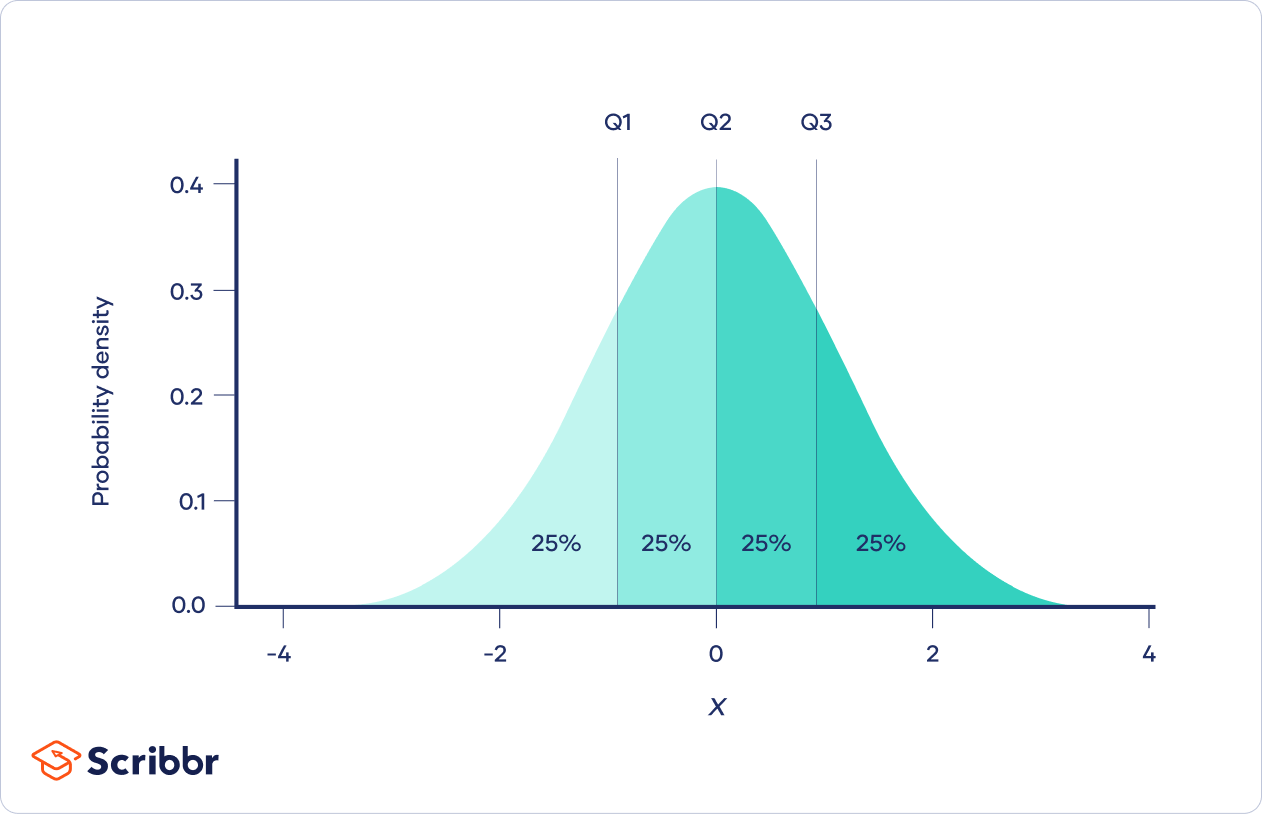
Q-Quantiles
Q-quantiles are the
Calculation
To divide a dataset into
- Sort the dataset in ascending order.
- Calculate the position of the
- If
Using NumPy
NumPy has multiple functions for computing quantiles including:
numpy.percentile(): Which takes a dataset and percentile (e.g.50) as arguments, and returns the value at that percentile.numpy.quantile(): Which takes a dataset and a decimal value representing the percentile (e.g.0.50) as input, and returns the value at that quantile.
Applications
Descriptive Statistics
Quantiles are commonly used to summarize the distribution of a dataset, and is commonly used as both a measure of central tendency and a Measure of Dispersion.
Outlier Detection
Quantiles are commonly used to identify outliers. One method involves flagging any observations that are more than 1.5 times the Interquartile Range (IQR) above the third quartile or below the first quartile.
Visualization
-
Box Plot: Visualizes the Five-Number Summary of a dataset, where the box represents the IQR, the line in the box is the Median, the "whiskers" represent the 25% of the data below and above the first and third quartile respectively, and the lines at the edge of each whisker represents the minimum and maximum values.
-
Q-Q Plot: A comparative visualization method which plots the quantiles of two distributions against each other, where typically, a real dataset is plotted against a theoretical dataset (usually a normal distribution).
-
Violin Plot: Overlays density curves over a box plot, where the width of the curve indicates the density of data points at specific values.
References
- J. Han, M. Kamber, and J. Pei, Data Mining : Concepts and Techniques. Burlington, Ma: Elsevier, 2012.
- GeeksforGeeks, “Quantiles in Machine Learning,” GeeksforGeeks, Mar. 12, 2024. https://www.geeksforgeeks.org/data-science/quantiles-in-machine-learning/
- “Quantile,” Wikipedia, Dec. 12, 2020. https://en.wikipedia.org/wiki/Quantile
- Atlassian, “A Complete Guide to Violin Plots,” Atlassian. https://www.atlassian.com/data/charts/violin-plot-complete-guide